𝙬𝙝𝙊𝘼! AI Writing Tool (UIUX Design)
whOA! is an AI-powered web app that enhances editorial writing by generating journalistic-quality copy in the right tone and style — all within a structured, ready-to-publish layout. The platform features three dedicated writing assistants: debrOAh, nOAh, and jOAnne, each designed to cater to different audience types, communication purposes, and publishing platforms.
This project focuses on creating an intuitive, human-centred experience that transforms AI collaboration into an effortless and engaging user experience.
Role: UI/UX Designer / Brand Designer/ Front-end Development / Coordinated with AI web developer on backend build.
Duration: 4-6 months
Agency: Tuber Productions
Project Launched: 2024
Background
whOA! (pronounced “woh!” or “wah!” — an expression of amazement, with the final letters standing for Offshoots Academy) is an experiment in human–AI collaboration for content writing.
Developed by Tuber for Offshoots Academy, whOA! features a suite of AI personas — debrOAh, nOAh, and jOAnne — each trained in different article types to co-create content alongside users for specific purposes and audiences. Drawing from a curated library of articles and guided by Tuber’s Secret Sauce principles, these personas offer contextual suggestions to refine tone, style, and voice — helping users continue, shape, or elevate their writing with clarity and intent.
Challenge
Problem statement: While AI writing tools are abundant, most adopt a one-size-fits-all conversational model that often overlooks context, voice, and editorial nuance. The challenge, therefore, was to create an AI-powered tool that could emulate the creative guidance of a human editor — one that supports users not just in generating content, but in developing and fine-tuning their writing craft.
Hypothesis: The aim of the design is to build an experience that feels fluid, responsive, and emotionally engaging — highlighting how whOA!'s suite of AI personas, trained on curated editorial content and guided by Tuber’s Secret Sauce principles, can enable a more natural and context-aware writing process. The approach is to empower users to overcome writer’s block, refine their tone and style, and stay immersed while in the act of writing.
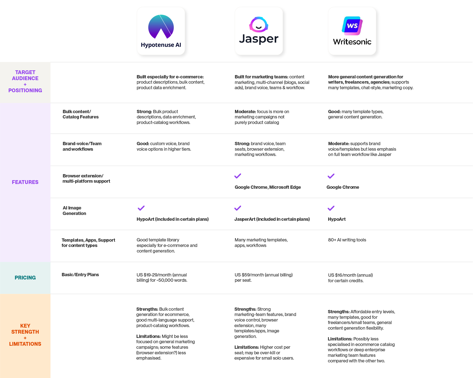
Competitive Landscape Analysis
As whOA!’s visual identity took shape, we conducted a competitive landscape analysis to better understand existing players in the market. The goal was to identify distinctive features, interface patterns, and user experiences that stood out — as well as to assess the strengths and weaknesses of each competitor. These insights helped inform potential enhancements for both current and future iterations of whOA!.
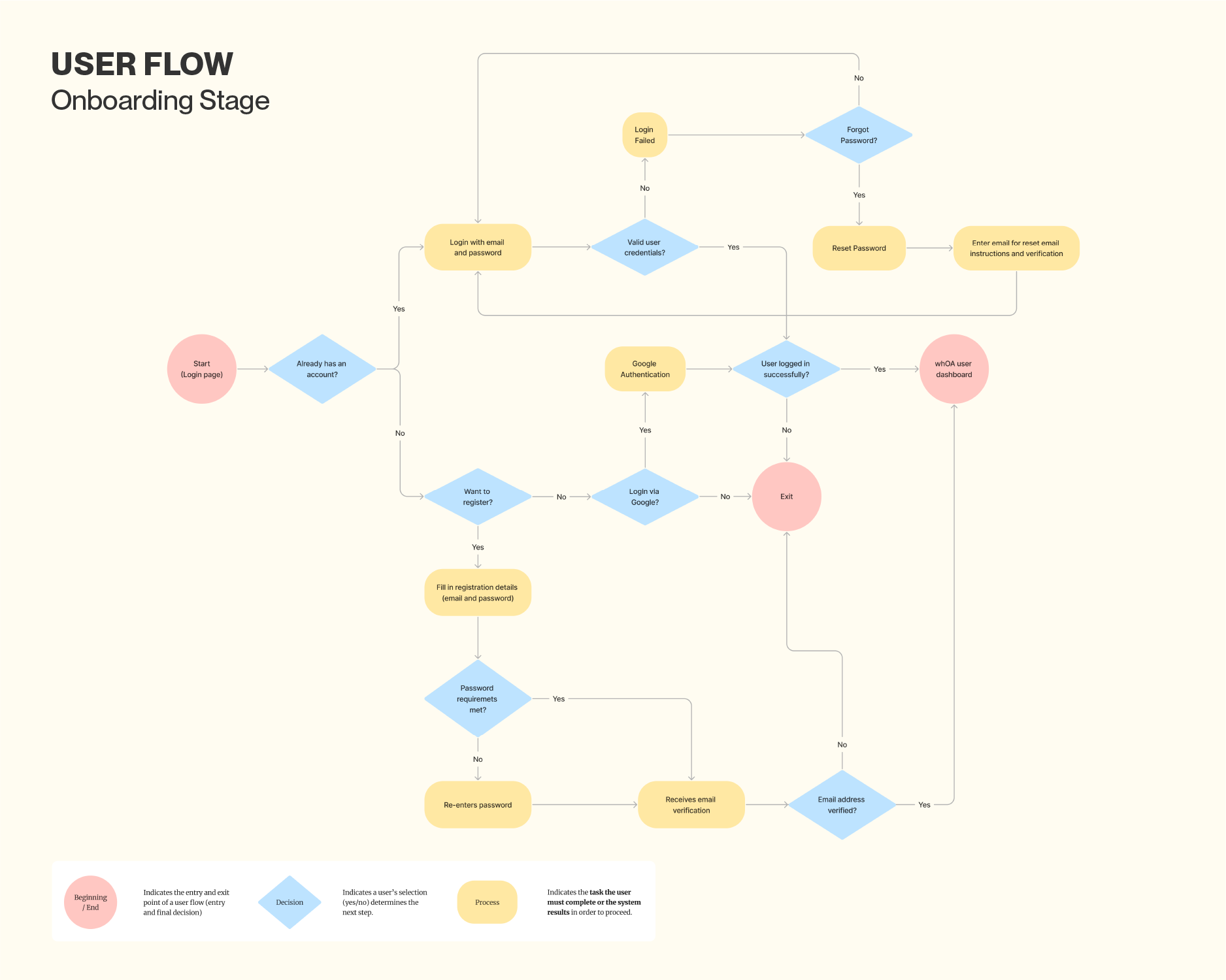
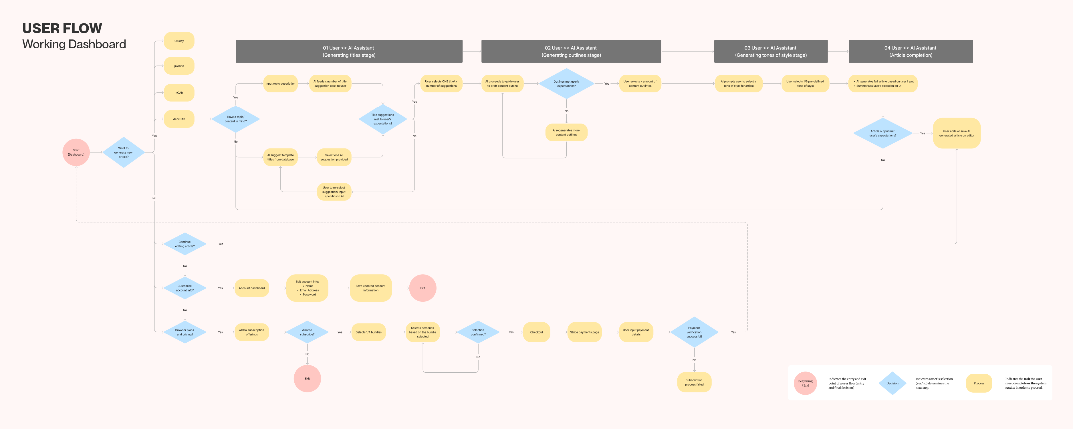
User flow (Onboarding + Dashboard Process)
During the early discovery stage of whOA!, we identified that the platform would differ from conventional AI tools, which often rely on a simple prompt-and-response conversational format. We wanted whOA! to feel more intuitive, guided, and expressive — giving users a sense of purpose and orientation from their very first interaction.
To achieve this, we designed a clear and consistent navigation structure that begins during onboarding. Key checkpoints were established to minimise cognitive load, incorporating progressive disclosures, contextual tooltips, and confirmation emails to guide users naturally through the interface.
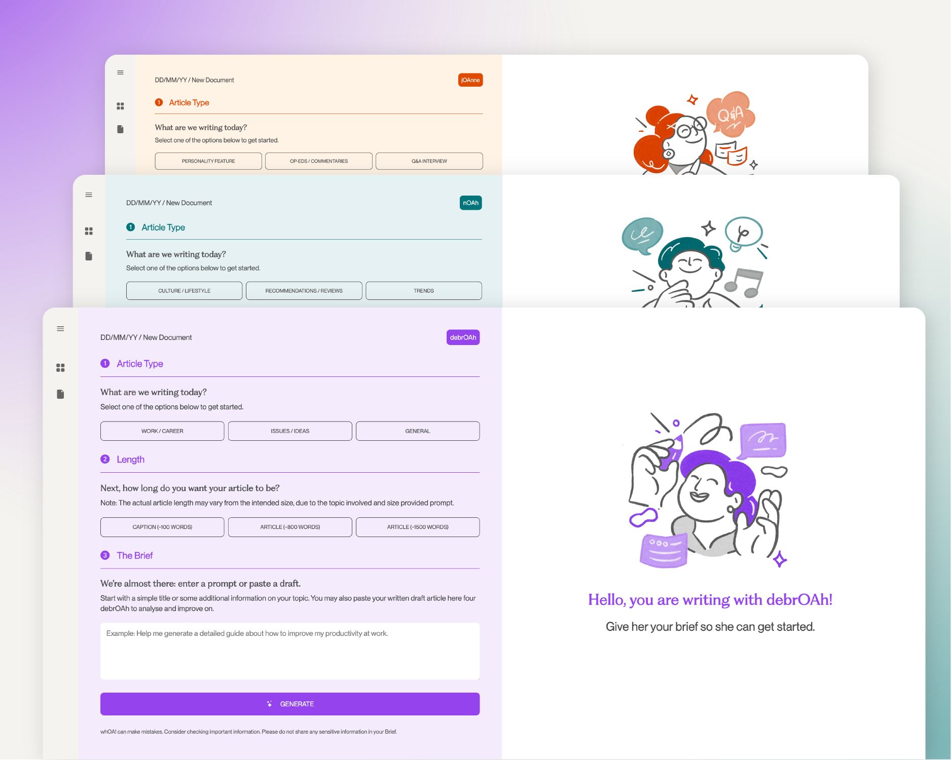
Once inside the dashboard, users are introduced to the three AI writing assistants — debrOAh, nOAh, and jOAnne — each presented with short descriptions that clarify their unique writing styles and use cases. This structured flow not only helps users select the right assistant for their task but also fosters confidence and familiarity as they explore the platform. The result is an onboarding and dashboard experience that feels both seamless and empowering — balancing usability with personality.
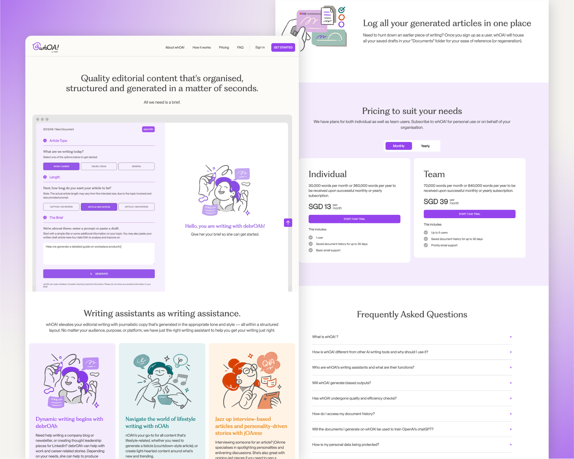
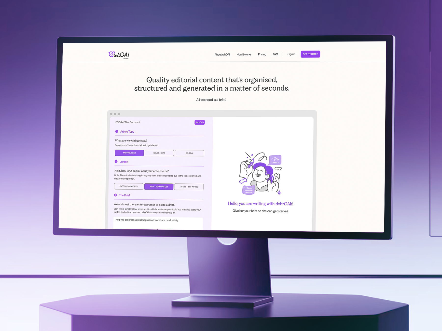
Building the Landing Page Experience
From the wireframing and prototyping stages to the final design, the landing page was conceptualised as a one-page, parallel scrolling layout to streamline navigation and enhance user flow. This approach eliminated the need for complex menus, allowing users to absorb content effortlessly while maintaining engagement. By structuring information in a clear, continuous journey, the design naturally guided users toward the sign-up process with minimal friction.
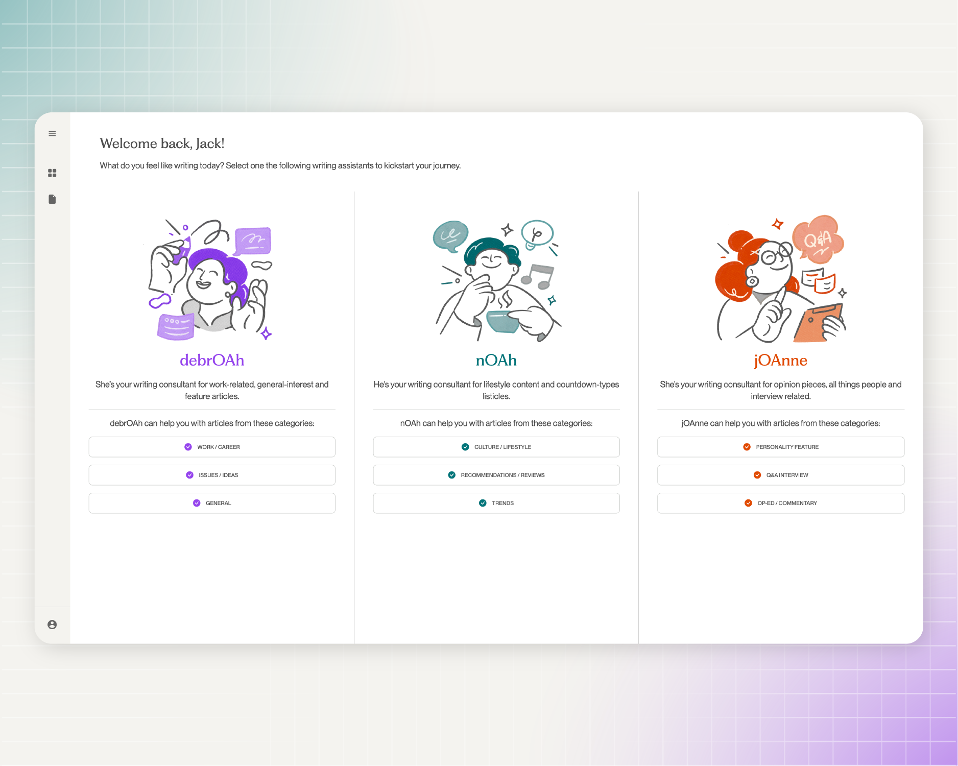

Building the First Interaction: User Dashboards and Onboarding Flow
The dashboard was designed so that upon entry, users are immediately introduced to the three AI writing assistants — debrOAh, nOAh, and jOAnne — each accompanied by concise descriptions highlighting their distinct writing styles and use cases. The clean, minimal layout reduces decision time, allowing users to quickly select a persona and begin their task.
Similarly, the onboarding screens were crafted with straightforward navigation and engaging illustrations to balance functionality with visual appeal, creating a smooth and welcoming experience throughout the sign-up process.
User flow (Onboarding + Dashboard Process)
During the early discovery stage of whOA!, we identified that the platform would differ from conventional AI tools, which often rely on a simple prompt-and-response conversational format. We wanted whOA! to feel more intuitive, guided, and expressive — giving users a sense of purpose and orientation from their very first interaction.
To achieve this, we designed a clear and consistent navigation structure that begins during onboarding. Key checkpoints were established to minimise cognitive load, incorporating progressive disclosures, contextual tooltips, and confirmation emails to guide users naturally through the interface.
Once inside the dashboard, users are introduced to the three AI writing assistants — debrOAh, nOAh, and jOAnne — each presented with short descriptions that clarify their unique writing styles and use cases. This structured flow not only helps users select the right assistant for their task but also fosters confidence and familiarity as they explore the platform. The result is an onboarding and dashboard experience that feels both seamless and empowering — balancing usability with personality.